Elevate your business presentations, visualizations and reports with the right font for style and readability.
Fonts matter
Often, the impact of fonts on the appearance and readability of your presentation or report is underestimated. Moreover, fonts play a vital role in enhancing readability. Research has shown that the difference in reading speed between fonts can be as high as 35%. Choosing the right font can be daunting. I’ve spent many hours searching for fonts, and on my machine alone, I have over 1,000 fonts installed. The design and selection of fonts constitute a science of their own. However, in this blog post, I’ll share everything you need to know to select the right ones for your business presentation or report.
For a quick overview, check out ‘to the p.’ summary below. If you want to dive deeper, keep reading… (reading time: 11 minutes)
Basic Recommendations: Use sans-serif fonts for body text. For titles, you can choose serif or slab serif for a professional look, or sans-serif for a clean aesthetic. Limit your font selection to a maximum of three.
Additional Considerations: Opt for a font with a high x-height and tabular spaced numbers for improved readability in body text and tables. Ensure the font supports your language and includes the necessary symbols.
My Recommended Fonts: Consider using Lato or Roboto for body text, or Noto or IBM Plex for non-Latin character sets. For titles, Merriweather is my preference, although sans-serif fonts work well too. You can download these fonts freely from Google Fonts if you don’t have them.
Font Usage Tips: Maintain consistency in the use of thin, bold, color, or condensed type. Also, uphold a clear hierarchy, extending this consistency to visuals. Always prioritize the reader or audience, ensuring they can quickly read and comprehend your message.
The basics
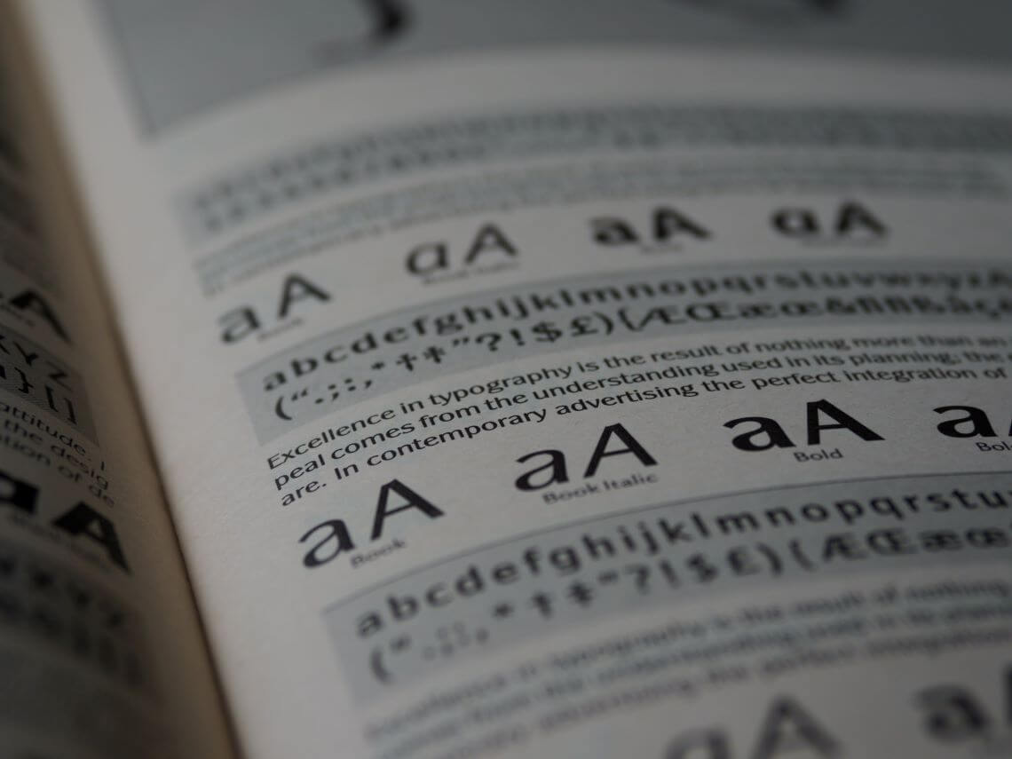
When we discuss fonts, we’re often referring to a typeface. A typeface is a family of fonts with a similar design. The term “font” pertains to a specific weight, width, and style within a typeface. There are four main types of fonts:

- Serif fonts have small extended lines, known as serifs, at the edges of their characters. Serif fonts offer better readability and legibility on smaller scales, such as in print (e.g., newspapers). Their distinctive appearance imparts a professional and authoritative or elegant look.
- Sans serif fonts lack serifs, presenting a more minimalistic and cleaner aesthetic. They are perceived as modern and informal, providing better readability on lower resolution screens.
- Slab serif fonts feature thicker serifs (slabs) for a distinct and robust appearance. While suitable for body text, they are often employed in logos or header text.
- Monotype fonts ensure all letters have the same amount of horizontal space. While convenient for computer code, it’s not recommended for general use, including tables. Many newer fonts offer ‘tabular spaced’ numbers specifically designed for tables.
The not so basics
Font size is measured in points, where 1 point equals 1/72 inch or 0.353 mm (though the original Didot points were slightly larger). However, there’s more to consider. The x-height, derived from the letter “x,” represents the height of lowercase letters and significantly influences readability in small sizes like body text. Even if two fonts are both 10pt, they can appear vastly different due to variations in x-height. I recommend opting for a font with a larger x-height for improved readability.

The counter is the open space in letters like “p,” “o,” or “e.” It should also be easily readable in smaller sizes, especially in body text. Selecting a font with an open and stable counter is crucial for clarity.
In business presentations, visualizations, and reports, numbers play a vital role. Monospacing, or tabular spacing, is essential in tables and aids in better reading and understanding of numbers in graphs. The amount of space can also vary based on the font weight (bold can be wider than regular or thin). Even within tabular space numbers, differences can exist. For instance, the number one may be centered differently in fonts like Open Sans (with the stem centered) and Lato (with the whole number centered). This can also impact the look of a table. Additionally, in older fonts, not all numbers were the same height; for instance, the “6” was higher, and the “9” dropped below the baseline. I recommend selecting a font where all figures share the same height.

Choosing your fonts
Note: If your company follows a corporate identity with specific fonts, adhere to those guidelines. However, if the corporate identity only outlines PowerPoint slide formats for large audiences, choose fonts that resemble your corporate identity for business reports.
When free to choose, always consider your audience and the purpose of your presentation or report. Keep in mind that fonts can significantly impact the overall appearance of your presentation or report. In general, I recommend the following:
- Body Text: Unless you’re writing for a newspaper, I suggest sticking to sans serif fonts for a modern look yet make sure they are easy to read.
- Titles or Headings: Choose from either serif, sans serif, or slab serif fonts, however ensure it has a professional appearance.
- Tables: Opt for a font where numbers are tabular spaced and lined, ensuring uniformity in space and height for easier readability.
Other than look or readability, some other things to consider:

- Language Support: Ensure your chosen font supports the symbols used in your language, especially those not found in the standard Latin character set.
- Weight Support: Choose a font with at least a bold type. Also consider using a variable font that gives you greater control over weight and width.
- Width Support: If a font has a narrow variant (e.g., Arial Narrow), it may eliminate the need for an extra font, maintaining consistency.
- Symbols Support: Check how the font displays commonly used symbols, as even currency signs may look unusual in certain fonts.
- Cross-Platform Support: If collaborating on both MacOS and Windows, be aware that not all fonts are standard on both platforms. Downloadable fonts may be required. Check the link here of some popular Microsoft fonts for the Mac.
A few additional tips:
- Distance Judgment: Assess the typeface from a distance or use a smaller size to get a better feel for its overall appearance.
- Font Limit: Use no more than three different fonts, aiming for one or two for better consistency. If using multiple fonts, ensure they complement each other or provide some contrast. Combining a sans-serif with a serif or slab serif font is a good combination.
Remember, the goal is to enhance your message through thoughtful font choices that align with your content, audience, and corporate guidelines.

My recommendations
For body text, my personal favorite is Lato. It combines high readability with a somewhat condensed style, enabling the conveyance of more information in a limited space. Lato also meets many of the criteria mentioned above and it scored high in reading tests. It’s available for free download on Google Fonts.
When it comes to titles and headings, I highly recommend Merriweather. This serif typeface exudes a friendly yet professional appearance and even offers a sans-serif version. While Merriweather is excellent for titles and headings, I advise against using it for body text. Alternatively, any of the aforementioned sans-serif fonts would also work well for titles and headings.
If you’re looking for popular and versatile options:
- Roboto: A popular font with a large family, including serif and slab serif typefaces.
- Noto or IBM Plex: Ideal choices if you need to cater to different non-Latin languages.
These fonts, including Merriweather, can contribute to a polished and effective design for your presentations and reports. Remember to choose fonts that align with your content, audience, and overall design goals.

Finding and matching
Like me, you may already have a plethora of fonts installed on your computer. A fantastic online service I frequently use is Wordmark. It not only showcases standard fonts but also lists those installed on your computer. You can select fonts and generate text to see how they look. This provides a quick overview of your fonts, much faster than experimenting in PowerPoint.

If you need to match a font, perhaps to align with your corporate identity, consider exploring Fontspring. By uploading an image, they can match it with their extensive database of over 900,000 fonts. Note that many of the fonts they suggest may not be free.
Another valuable tool for font matching is Identifont. Although it’s been around for a while, it remains a helpful service for finding the fonts you need. Explore these resources to streamline your font selection process and ensure a cohesive and polished design for your presentations and reports.
Finally, Figma has a page on their site about fonts that match well together. For a number of popular fonts (from the Google archive) they present some matching options.
Professional sources
Nowadays, many fonts come pre-installed with your OS (e.g., Windows 11 with 63 fonts). However, if you want to install new fonts, consider these reliable sources for professional use:
- Google fonts: Offers an excellent library of professional fonts for free.
- Adobe fonts: Provides a diverse font library along with advanced tools for font discovery and selection.
- Myfonts: Features a extensive library of various fonts for professional use.
- 1001 fonts: A substantial font library; remember to filter under font categories.
- Dafont: Offers a wide selection of fonts; remember to filter by the appropriate category.
When choosing between different file formats, always opt for variable or OFT (Open Type Font) if available for optimal versatility. If you want to know more about font file formats (e.g. new formats for websites like WOFF) read this. Ensure to check the license for any free fonts you download. These sources can significantly enhance your font selection options for business reports and presentations.
Effective use of your font
Now that you’ve chosen and installed your font, let’s explore how to use it effectively to guide your reader through your story. Modern fonts, especially variable ones, offer numerous possibilities for text modification. Here are some guidelines on when to use specific features:

- Thin Fonts: Reduce perceived contrast and are best avoided in small text or low-contrast situations. You can use it in larger fonts for titles or headings to give your presentation a minimalistic and modern vibe.
- Narrow Fonts: Hard to read; reserve for situations with limited space in graphs or tables. Consider trying a smaller size first.
- Size Matters: Don’t go too small; ensure text remains easy to read at all times.
- Uppercase: Harder to read but looks cleaner. To offset the problem of readability you may want to space out letters, decrease their size slightly, and use a heavier weight (bold). Best suited for specific labels or headings.
- Color: Use to highlight text or titles; it can also fade less important text into the background. Ensure enough contrast with the background color and stick to your company’s corporate identity or presentation theme colors.
- Bold: Grabs attention and exudes confidence. Use in titles, headings, or to highlight a few words.
- Italics: Grab attention subtly. It is suitable to use inside larger bodies of text to emphasize something or to denote titles of books, films, art, etc., or the use of foreign language.
- Underline: Mostly replaced by italics in text bodies but can still be used in headings or titles.
Remember, consistency is paramount. Ensure uniformity not just in colors and fonts but also in the hierarchy of font usage, extending this to the visuals (graphs) in your report. Consistency serves as a testament to your attention to detail and professionalism, enhancing the overall impact of your presentation or report.
Examples


I hope that you learned a thing or two and enjoyed the read.
Sites worth exploring
If you’ve developed a keen interest in fonts and are eager to dive deeper, here are some links for further reading:
- Google Fonts: A top choice for a wide collection of business-friendly fonts. Additionally, they offer interesting articles about fonts.
- Adobe fonts: Provides a vast selection of fonts and advanced methods for font selection. Check out their blog for intriguing articles.
- Figma: Has a page on their site for matching fonts from the Google archive.
- Finding the best free fonts for numbers blog post by Samantha Zhang.
- Fonts for complex data blog post by Jonathan Hoefler.
- Choosing Fonts for Your Data Visualization blog post by Tiffany France.
- UPPERCASE in UI Design blog post by Bradley Nice.
- Color Contrast Checker service to check the contrast of colors.
- Accessible Font Sizing, Explained blog post by Andrés Galante.
- Condensed fonts: The good, the bad, the ugly blog post by Carrie Cousins.
- Do’s and Don’ts of Using Light Typefaces blog post by Anthony on UX Movement.
- Everything about font formats blog post by Akash Pandey.
These resources cover a range of topics related to fonts, from free font options to design considerations and best practices. They can be valuable references for anyone looking to enhance their understanding and use of fonts in various contexts.
Share this post on LinkedIn